 I've kept my logo simple my just using my initials L & F combined together. The name Neutro Cane was something i came up with a while back as my colour pallete always mainly consists on neutral colours.
Monday, 23 May 2011
My logo and business card
I've kept my logo simple my just using my initials L & F combined together. The name Neutro Cane was something i came up with a while back as my colour pallete always mainly consists on neutral colours.Stepmother
 This is the final design of the stepmother, i decided to go with just a black shadowed person as it goes better with the characters personality. She is an evil ring leader who owns the carnival.
Ferris Wheel
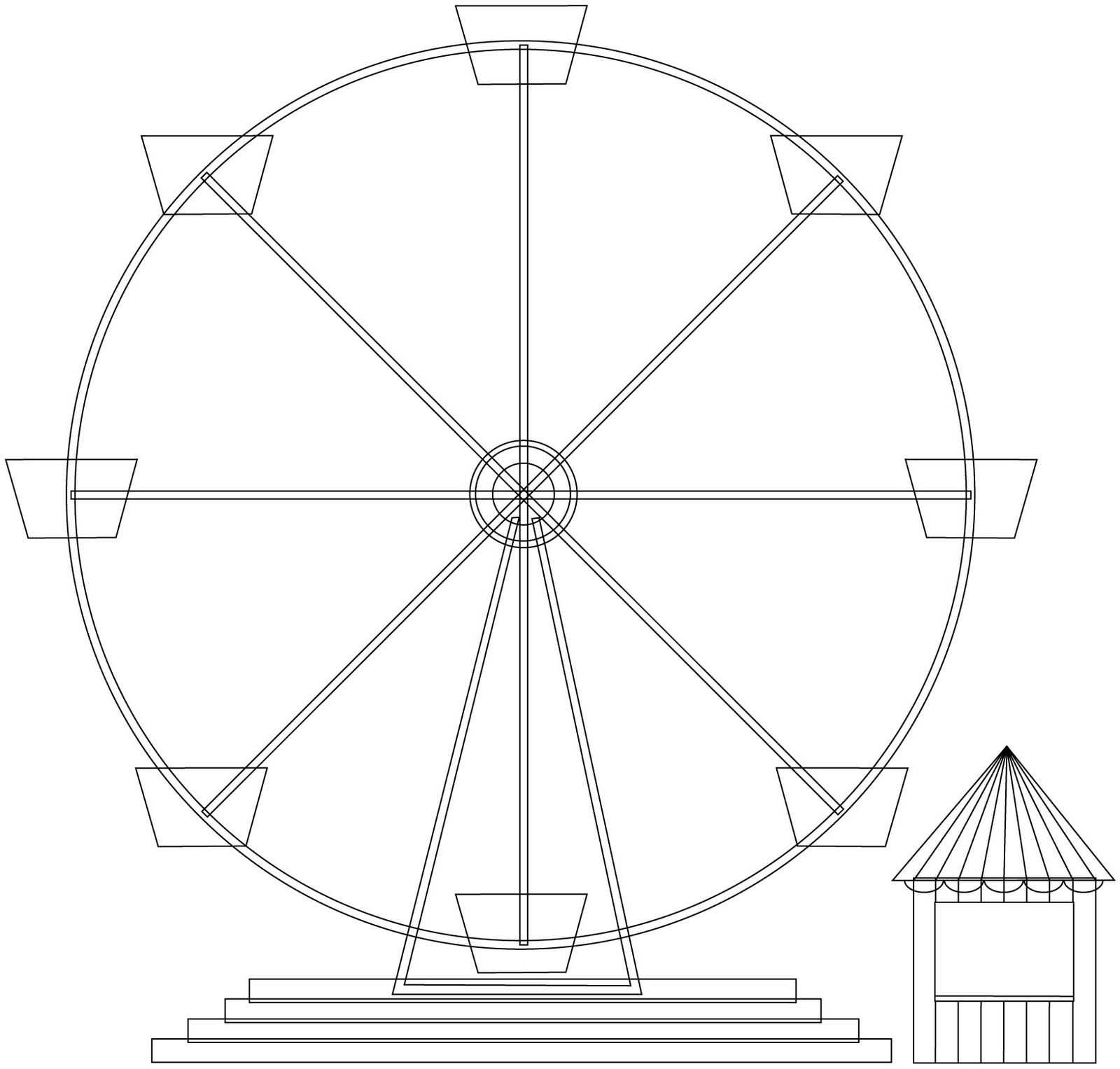
 This is the final version of the ferris wheel i created. I am very pleased with how this has turned out as the colours work really well together and i'm happy with the way the texture i have used has worked as it is not too heavy for the colours i have used.
Tent
 This is the final design for my tent which i think works better than the other one i created as it is not as flat with it being rounded rather than rectangular and it looks more realistic than the other one.
Tuesday, 22 March 2011
Carnival Assets

 These are a few assets i created for my carnival. I feel the ferris wheel turned out the best as it has more detail than the others and looks the most realistic as the others look rather plain.
Friday, 11 February 2011
Carnival test
 I created my tent asset in illustrator then took it into photoshop to colour, i felt it looked to plain and flat so i took it into cinema 4d to do a test. In this test i played around with the lighting that i could use for my carnival environment. I added spheres with an illuminance glow to create the effect that lights are placed along the top of the tent. I think this works well as the glow will work well in a carnival environment especially in the evening scenes.
City storyboard
 This is the storyboard for the city i created for the 4 Mations group project, this was used as a guidline by my group in order to create the final animation.
Road storyboards


These are the storyboards i created for the road scene for my 4 Mations group project. These were not used for the final animation but were used as a guidline for the logo coming togther.
Sunday, 9 January 2011
Bird

Last but not least i created the bird, i like the top and side view but am not to keen on the front and back view as the bird looks very thin and the folds don't stand out as much and get lost in amongst one another.
Butterfly
 Using the same technique i created my butterfly which i think turned out well and still gives that origami look with all the folds being included so it doesn't look as flat.
Bug

As our logo had been created in illustrator then taken into cinema 4d i decided to experiment and create my origami in illustrator.
I like the way this turned out as it is a nice clean look compared to the actual origami i made and it still includes alot of detail as i drew in all the folds.
Origami bird


Sticking with things that can fly i created a bird as i feel this will also fit in with more environments and will work better as our logo will also be flying around in the air.
Origami butterfly


The butterfly could also be used in a city environment or any other environment. This is the one i am most pleased with as i feel it will fit in more with the logo and also the folds stand out more than the bug which looks kind of messy.
Origami bug


As my groups 4 MATIONS idea was to do with paper flying around and coming together to form the logo in different environments we felt other paper assets should be included.
Using online tutorials i created an origami bug this could be used in a city environment.
Friday, 7 January 2011
Textured 4
I felt the 4 logo looked far too plain and flat so i did an experiment using different textures to try and lift it a bit. As this logo looks like paper the textures i used were different kinds of paper from crinkled to toned.

Subscribe to:
Comments (Atom)